For my Multimodal Analysis, I chose to delve into the world of retargeting ads for the upcoming presidential election. These are ads that gather information from your cookie cache to see what you have previously looked at. The majority of these ads are attack ads and are very simple, with only a few lines of text so when you scan over a website, you only have to briefly look at it to get the whole message. So now let's get started.
Below are links to the 6 ads that I found when looking for examples of retargeting ads. 3 pro-Romney ads and 3 anti-Romney ads.
Romney Ad #1
Obama Ad #1
Romney Ad #2
Obama Ad#2
Romney Ad #3
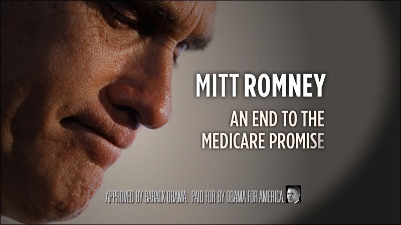
Obama Ad #3
Seeing as how the different organizations and who they are backing have different methods of trying to gather votes/support, it will be interesting to analyze it further to see why the majority of ads that I found for Romney are Pro-Romney and the majority of the ads for Obama are Anti-Romney.
For your project, I noticed the fact that you are looking into several different ads with different audiences in mind. For example, your Obama ad #3 mentions medicare, which targets the older generation who are or are going to be on medicare. Romney #3 if you look close enough also seems to target combat veterans. It is an interesting project, and I love your choice of genre.
ReplyDeleteI would also look at the gestural aspects of your images, what are the people doing? Sometimes they bring you’re eyes towards the text, in others a man off to the side. As much as anything this and organization seem to be the stronger points of the images.
I think that covers it? Other then that, I would consider the use of color in your images. If you noticed in Obama # 1, it is in black and white and it seems a little cold while Romney ad # 2 is in black and white as well, but it seems a little warmer, more friendly. They are all also very consistent on using Red, White, and Blue, why is that? Probably because it’s patriotic. :)
Either way, good project! I hope to see the final result soon.
For these ads it is clear they are focusing on a target audience.
ReplyDelete1. Romney's first ad focuses on the use of color and visuals to attract the viewer. His mane slogan is almost directly centered, with a small pitch below it on the left and a picture of Mitt on the right.
2. An interesting decision made by the Obama team, was to center ads around Mitt Romney. It is very strategic though, designing the ads to be almost spitting images of the Romney ads. The use of color or lack of, makes the audience lack interest in Romney.
3. Romney's next ad is an interesting visual. The creators are placing an emphasis on Romney and his wife. Often times the candidates wives are used in campaigns to show the persons family lives. This is attracting a very conservative audience.
4. This ad, is similar to the previous made by Obama. The ad uses framing very well. The viewer is immediately drawn to Mitt Romney's Face. The subtle blue line draws the eye to the slogan.
5. This next ad created by Romney is an excellent use of visual rhetoric. The picture captures Romney working along side blue collar Americans.
6. This ad is also an excellent use of visual rhetoric. It is a up close picture of Romney's face, with the slogan "an end to the medicare promise" His face looks disappointed, like he let the audience down.
Overall the use of visuals is very strong, and gives the viewer a feeling of empathy for either side.
-Jessie Walsh
I think that each candidate shows that it is important to target multiple audiences through advertisements. I would pay attention to how each ad targets a specific audience.
ReplyDeleteRomney Ad #1: I think that the color choice stands out in this ad because the contrast of “take congress back” against the navy background instantly draws the viewers eye to Romney’s slogan.
Obama Ad #1: The picture of Romney almost makes the viewer question who the ad is for, but since it is in back and white makes Romney seem dull. The text also stands out against the background and it frames Romney’s face.
Romney Ad #2: This ad seems like it is targeting that he is a family man. They both seem happy and since he is walking a little in front of her it a almost seems like he leading her somewhere.
Obama Ad #2: Obama’s second ad is extremely similar to the first one. Obama’s slogan lets the audience know that he is talking about Romney since his face is above the slogan.
Romney Ad#3: In this ad shows that Romney is working with the average American and the flag in the background also stands out.
Obama Ad #3: I think that Romney’s facial expression compliments the message that Obama is trying to get his audience to believe.
Body language is used in the ads to convey the tone and also to compliment the messages of the ads.
For your choice of covering the 2012 Presidential elections, I suggest paying specific attention to the purpose and audience of the ads you selected, with the audienc being the group that the ad seems to reach out for the most.
ReplyDeleteIn Romney #1, the use of colors is apparant in the ad. It focuses on a red, white, and blue scheme, similiar to the U.S. flag. Additionally, the contrasting background colors and letter colors help draw attention.
In Obama #1, color once again is the star, with a black and white image of Romney with a negative text attached, the dulled image helping the large, bold letter stand out. Emphasis also appears because of this color different.
In Romney #2, contrast is used to draw attention to the Romney logo due to the black and white background image.
In Obama #2, contrast once again finds a use by helping the white text boldy stand out against the black background it was placed on.
In Romney #3, organization appears to be the key element, with the words "work for welfare" appearing on the image, with the image it's attached to apparantly showing Romney at a work environment.
In Obama #3, emphasis is placed on the text in the image by putting it in the center of the screen to help draw attention.
In short, the ads vary vastly in their content, but can still be compared based on their target audiences.